

The power of editing in interior design is not a preference for empty rooms or an excuse for minimalism. It is the disciplined ability to decide what deserves attention, what supports the architecture, and what can be removed without diminishing the experience. In a luxury interior, confidence rarely announces itself through quantity. It appears in the measured distance between objects, the quality of a material allowed to remain visible, and the single chair, painting, or light fixture that has enough room to matter.
This is why experienced designers edit more than they add. They assess proportion, circulation, sightlines, light, use, and emotional tone before specifying another layer. The result may be calm, richly collected, or even exuberant, but it never feels accidental. This guide examines how to edit a room without draining it of personality, how to use negative space as an active design element, and how to recognize the moment when a scheme is finished.
Editing Is a Design Act, Not an Absence of Design
From accumulation to intention
Every room begins with competing possibilities: a larger sofa, another pair of lamps, art for an empty wall, a rug layered over the first rug, and the decorative objects a client has collected over time. The designer's work is not to reject these possibilities automatically, but to establish a hierarchy. Which element should be understood first? Which should be discovered later? Which is merely filling a visual gap created by uncertainty?
Intentional interior design treats selection and subtraction as equal forms of authorship. A hand-finished console may be more successful against an undecorated wall than beneath a crowded salon arrangement because its silhouette, joinery, and patina can be read clearly. In a hotel lobby, removing three occasional tables may reveal a more generous arrival path and improve the sightline to reception. In a residence, reducing a living room from six accent pillows to three can make the upholstery, rather than the accessories, feel luxurious.
Why expensive rooms can still feel unresolved
Cost does not create coherence. A room may contain collectible lighting, custom millwork, antique furniture, and original art yet feel restless if each decision competes for status. The issue is often not that any one object is wrong; it is that there is no agreement about relative importance.
Before adding, test the room from the doorway, the primary seat, and the circulation route. Photograph it in daylight and after dark. If the eye lands everywhere at once, identify the objects with the weakest relationship to scale, function, or narrative. Editing those elements gives the strongest pieces authority.
Luxury is not the evidence that a room could hold more. It is the confidence to let the right things remain visible.
Negative Space in Interior Design Gives Objects Their Voice
Space is an active material
Negative space in interior design is often described as what is left over, but that definition understates its role. The clear area around a sculpture establishes its silhouette. The floor beneath a coffee table clarifies circulation. A quiet section of wall gives a painting a visual boundary, much as a mount or frame does in a gallery.
Consider a 10-by-12-foot living room with a 90-inch sofa, two lounge chairs, and a 9-by-12-foot rug. If the furniture is pushed to the perimeter and every table is occupied, the room may feel smaller than it is. Pulling the seating inward, leaving approximately 30 to 36 inches for principal walkways, and removing one table can create a stronger center and more usable space. The edit is spatial, not merely decorative.
Scale, breathing room, and the eye
Breathing room should be calibrated to the object and the architecture. A small photograph needs a closer visual relationship with neighboring works than a monumental canvas does. A tall vase may need a lower console and an unbroken wall behind it. In a gallery, a 48-inch sculpture might require several feet of clear floor around it; in a residential bookcase, the same object can work within a denser composition because the context is intimate.
Use negative space to support function as well as beauty. Leave a landing zone beside an entry door, preserve clear access to a drawer, and keep a pendant high enough that it does not interrupt conversation. A room that photographs beautifully but forces people to sidestep furniture is not edited; it is merely staged.
More Is More vs Less Is More Interior Design
The false opposition
The debate around more is more vs less is more interior design is useful only when it moves beyond slogans. Maximalism is not a license to fill every surface, and minimalism is not a requirement for pale walls and unadorned furniture. Both approaches depend on control. A richly layered room needs repetition, rhythm, and a few points of visual rest. A sparse room needs exceptional proportion, material precision, and enough contrast to avoid feeling provisional.
Curated maximalism might combine a patterned silk rug, lacquered cabinetry, a carved wood chair, and tightly edited art. The abundance comes from relationships: a repeated color, a shared period reference, or a deliberate tension between polished and aged surfaces. By contrast, a restrained living room might use one large oil painting, a deeply textured wool rug, and a sculptural table. It is not less designed; its decisions are simply more exposed.
Choosing the right degree of density
Use the architecture and the client as evidence. A Victorian townhouse with tall rooms, layered moldings, and a collector's art program can carry a denser composition than a compact new-build apartment. A boutique hotel bar may benefit from theatrical material overlap, while its corridors need visual relief to support wayfinding and calm.
- Choose curated maximalism when the client has a meaningful collection, the architecture can support pattern, and the scheme benefits from layered discovery.
- Choose restrained luxury decor when material quality, views, or architectural detail should lead, and when maintenance or circulation demands clarity.
- Use a hybrid approach when public areas need composure but private rooms can hold more personal expression.
The question is never how much decoration is fashionable. It is whether the density makes the room easier to understand and more rewarding to inhabit.
How Designers Decide What Stays
A practical edit by hierarchy
Begin with the fixed elements: architecture, windows, doors, flooring, built-ins, and major lighting points. Next establish the functional anchors, such as the sofa in a living room, the bed in a bedroom, or the dining table in a hospitality setting. Only then assess secondary furniture and objects.
For each item, ask four questions: Does it serve the room's use? Does its scale support the architecture? Does it contribute a distinct material, color, or form? Would the room lose something specific if it disappeared? The final question is especially revealing. If removing an object changes nothing except the amount of dusting, it may not have earned its place.
Testing a specification before committing
Designers can create a temporary edit before making a purchase. Remove accessories for 24 hours, tape the footprint of a proposed rug, or place a paper template where a wall sculpture will hang. In a collector's apartment, lean two competing artworks against the wall and live with each sightline before drilling. In a hotel lobby, use temporary tables and chairs to test queueing, luggage clearance, and group conversation.
Specification should include the cost of visual noise. A $3,000 side table that eliminates the need for two smaller tables may be the better value, even if its price is higher. Likewise, a custom console with concealed storage can replace a collection of baskets and trays while preserving the objects that genuinely add character. Explore carefully scaled pieces in Opul Mkt's living collection and judge each item against the room's complete composition, not in isolation.
Material Restraint Makes Luxury Legible
Fewer materials, better understanding
Restrained luxury interiors are not necessarily neutral. Their richness comes from allowing a limited palette to show variation: honed stone beside brushed metal, open-grain oak against woven wool, or aged bronze near a glossy lacquer. When every surface introduces a new finish, the eye cannot register the qualities that make the materials valuable.
Material editing is particularly important in high-traffic settings. A boutique hotel lobby might limit its palette to terrazzo, walnut, leather, and bronze, then vary texture and scale within those categories. In a residence, a wool rug can soften a stone floor while a linen sofa and oiled wood table establish a quieter tactile sequence. The restraint makes maintenance decisions clearer as well: durable fibers belong in circulation zones, while delicate silk or fragile finishes can be reserved for lower-contact areas.
Let lighting complete the edit
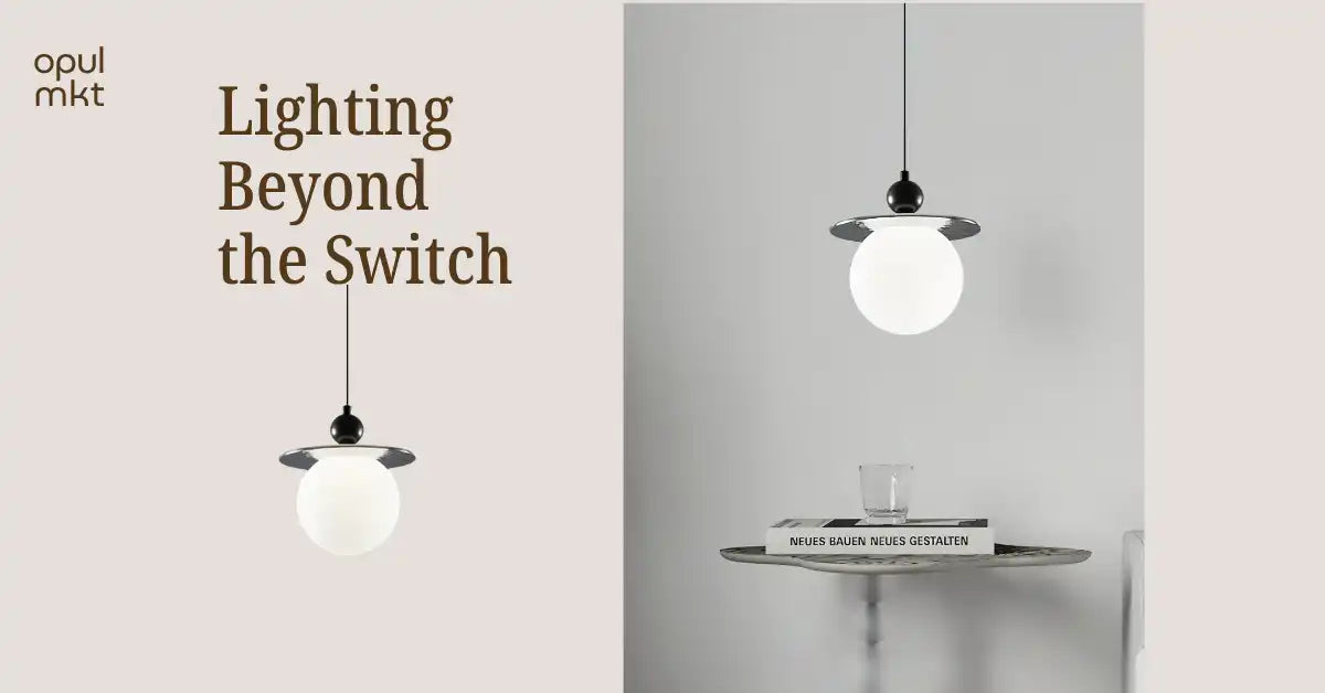
Lighting often reveals whether a room has been properly edited. Too many decorative fixtures can produce competing focal points, while a single ceiling fixture may leave art and seating visually disconnected. Layer ambient, task, and accent light, then control their intensity separately. A 2700K to 3000K color temperature generally supports residential warmth, but the correct result depends on the finishes and the light source's color-rendering quality.
A sculptural chandelier over a dining table may be enough to establish identity, supported by concealed or recessed ambient light. In a gallery-like hallway, discreet wall washers can make one artwork important without adding another object. When selecting fixtures, confirm UL or ETL listing, dimmer compatibility, mounting conditions, and actual fixture dimensions before the aesthetic decision becomes a costly change order. Opul Mkt's indoor lighting selection is a useful starting point for comparing the visual weight of pendants, sconces, and portable lamps.
Signs a Room Is Overdecorated
Symptoms of visual fatigue
The signs a room is overdecorated are often physical before they are stylistic. People hesitate at the entrance, walk around rather than through the space, or cannot identify where to sit. Every horizontal surface has a small arrangement, every wall has an object, and no view remains quiet long enough for the eye to rest.
Another warning sign is substitution without improvement. A client keeps buying cushions, art, or accessories because the room still feels wrong, but the underlying issue is scale: the rug is too small, the sofa is undersized, or the artwork is scattered rather than anchored. Accessories cannot reliably correct an architectural or furniture proportion problem.
A disciplined reset
Remove 20 to 30 percent of the movable objects and live with the room for a week. Do not replace them immediately. Notice whether conversations improve, cleaning becomes easier, and the main furniture reads more clearly. Return only what adds function, memory, contrast, or a necessary note of scale.
For a crowded entryway, retain one mirror, one substantial console, one light source, and a vessel or sculpture with genuine presence. For a bedroom, remove decorative pieces that interfere with bedside use and keep textiles in a deliberate hierarchy: upholstered headboard, coverlet, sleeping pillows, and one or two accent cushions. If the room still feels incomplete, solve the strongest structural issue first rather than restoring clutter.
How to Know When a Room Is Finished
Completion is a felt condition
How to know when a room is finished is less about reaching a prescribed number of objects than recognizing when each decision has a job. The room should support its intended activities, offer a clear visual entry, and contain enough irregularity to feel inhabited. It should also withstand the removal of one decorative piece without collapsing.
Try the subtraction test: take away the least essential object and ask whether the room becomes calmer, weaker, or simply different. If it becomes calmer without losing identity, the object was probably unnecessary. Try the arrival test as well. Enter after being away for several hours and note what you see first. If the intended focal point is buried, edit or reposition until the hierarchy is immediate but not forced.
Confidence, not emptiness
A finished room contains evidence of life: books that are used, art with a point of view, a comfortable chair, and materials that will age rather than merely photograph well. The aim is not showroom perfection. It is a composition that feels settled enough to function and open enough to evolve.
In a developer's model apartment, this may mean leaving a wall unfilled so prospective buyers can understand the volume of the room. In a collector's home, it may mean rotating works rather than displaying every acquisition at once. Editing protects future possibility. It allows a new object to enter later without forcing the room into permanent visual competition.
FAQ
It is the ability to improve a room through selection, hierarchy, and subtraction rather than continuous accumulation. Editing clarifies circulation, makes focal points more legible, and allows craftsmanship to register. It can also reduce unnecessary spending because the designer solves proportion and function before adding accessories. A successful edit does not make a room generic; it makes the client's strongest architectural, material, and personal decisions easier to see.
Start by protecting clear areas around important objects and along circulation routes, rather than removing everything. Leave a section of wall around a major artwork, keep table surfaces partly open, and avoid pushing every piece of furniture against the perimeter. Balance quiet space with texture, scale, and meaningful objects. If the room feels cold, add warmth through a rug, wood, layered lighting, or upholstery before filling every available surface.
Common signs include blocked pathways, crowded tables, competing focal points, and accessories that repeat the same visual role. A room may also be overdecorated when people keep adding items to solve a furniture or scale problem. Photograph the space from its main entry and remove a small group of movable objects. If the primary furniture and architecture become clearer, the room likely needed editing rather than more decoration.
Neither is inherently superior. Curated maximalism works when the architecture, collection, and client support layered pattern and contrast; minimal or restrained schemes work when proportion, views, and material quality deserve attention. Both require discipline. The right choice depends on circulation, maintenance, natural light, and the emotional atmosphere the room should create. A hybrid approach is often strongest, with richer density in intimate rooms and more visual relief in public or transitional areas.
A room is usually finished when it functions comfortably, has a clear visual hierarchy, and does not require another object to explain its identity. Test the scheme by removing one item, entering from different viewpoints, and using the room at different times of day. If the edit improves calm without reducing personality, keep it. Completion should feel settled rather than frozen; a finished room can still accommodate future art, travel finds, or seasonal changes.
Usually, it protects value. A smaller number of well-scaled, durable, and meaningful pieces often performs better than many inexpensive objects that require replacement. Editing can also justify investment in a substantial rug, custom storage, or a properly scaled light fixture because the budget is not dispersed across filler. For commercial projects, fewer but more robust pieces may lower maintenance and replacement costs while improving the guest experience.
Prioritize circulation, cleanability, and durability before styling. Keep pathways approximately 30 to 36 inches where possible, secure rugs with appropriate pads, and avoid fragile objects at corners or within reach of bags and luggage. Use closed storage to contain small necessities, then display only a few durable pieces with strong silhouettes. Confirm upholstery performance, lighting safety, and applicable commercial requirements before final specification.
Explore a More Confident Interior
The most persuasive rooms are not those with the longest inventory lists. They are the rooms in which scale is resolved, materials are allowed to speak, and every object seems to have arrived for a reason. Editing is therefore not a final styling trick; it is a project method that protects clarity from the first plan through installation.
When the composition is ready, explore pieces that can carry their visual weight without demanding constant company. Opul Mkt's collections of rugs, wall art, and decor offer considered starting points for the final layer. For a more tailored conversation about a residential, hospitality, or trade specification, review the bespoke service or trade program. The next decision should not be what else the room can hold, but what it is ready to make visible.



Leave a comment
This site is protected by hCaptcha and the hCaptcha Privacy Policy and Terms of Service apply.